More elven tutorials for the Spire of Dawn / High Elves comeback in volomir.com. Today the complete tutorial on how to paint the Swordmasters of Hoeth by Volomir. The whole article has been taken back from the old blog, photos refurbished, for your enjoyment.
Painting High Elf Swordmasters of Hoeth
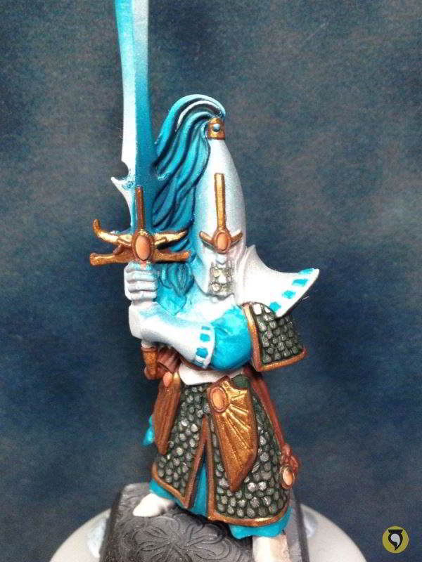
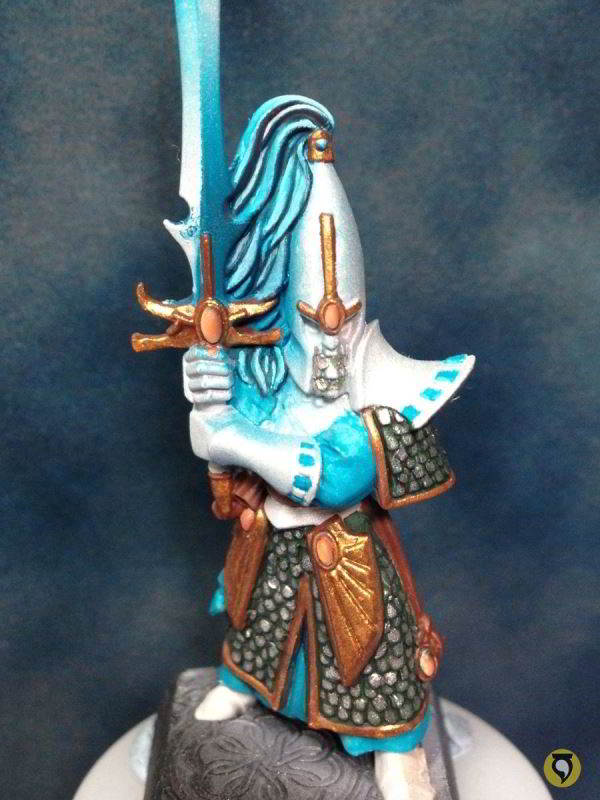
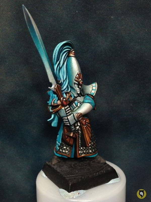
Following my project to build an army of High Elves around the hero that is the elf prince of Tribute to the Fallen, here is the complete article on the Swordmasters of Hoeth. This is the final compilation of all the steps of the process which I shared with you along the process of creating the Swordmasters of Hoeth.
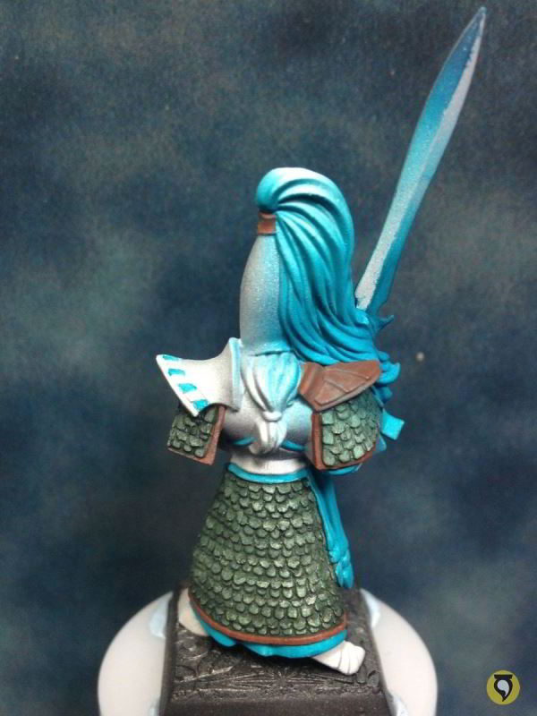
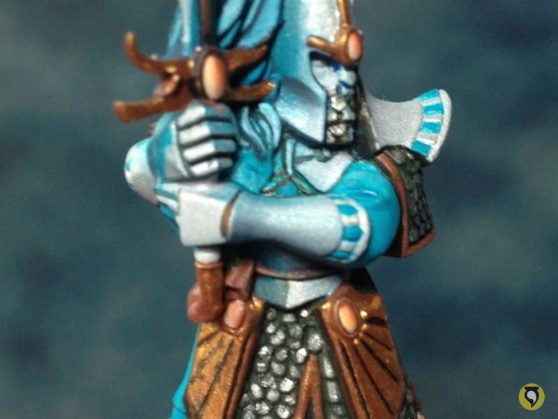
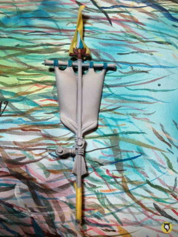
The miniatures are from the Warhammer: Island of Blood box, just like the High Elves Sea Guard I painted in 2011. I followed a very similar approach for the painting. I performed some minor conversions, specially to the armour scales, too big for my taste, and also modified the banner so that I could paint a nice freehand instead of painting some boring reliefs that I dislike. Then I used airbrush as much as I could so that I used as little time as possible, and get the best out of it.
There is another thing which I did differently this time: the basing process. What I learned from the previous experience is that even though it is much more comfortable to paint the miniature separate from the base and glue them after they are all painted, it is much more time consuming, because you paint things in the base which you don’t need to paint, and also, gluing and basing after the paint is done is also quite dangerous, you can destroy the work already done. So this time, Iconverted first, created the bases, glued the miniatures to the bases, and then I started painting. Let’s get to it!
Figures Preparation
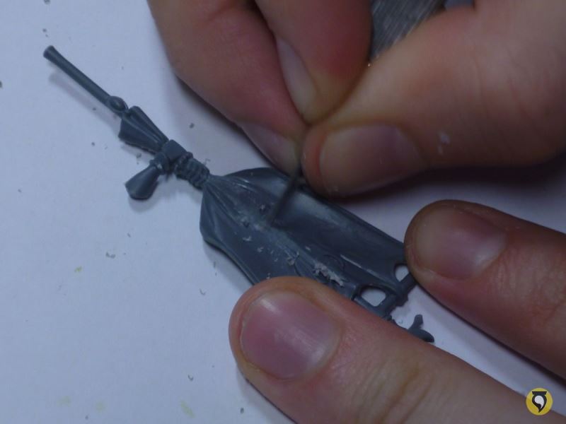
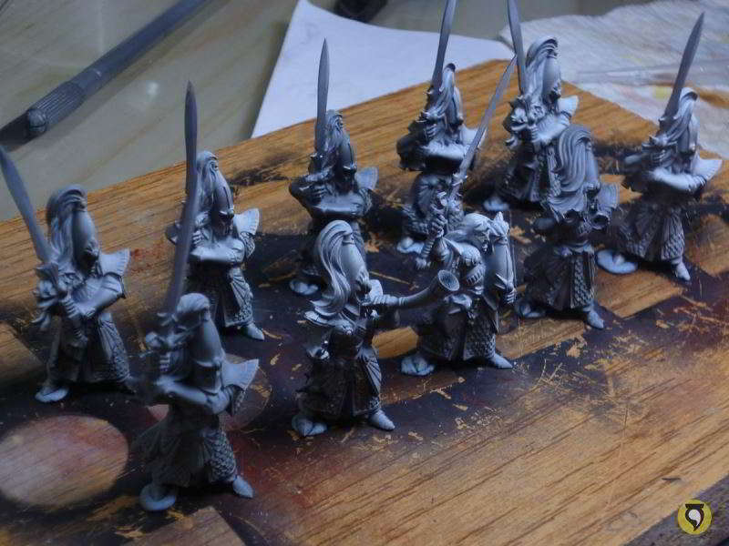
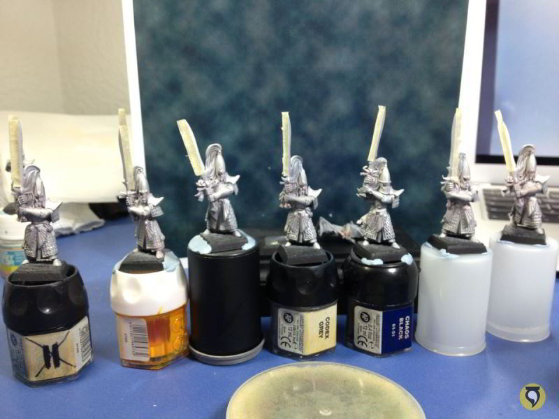
So first of all, I took the miniatures out of the sprues and cleaned them.

No mercy for those horrible mould lines!

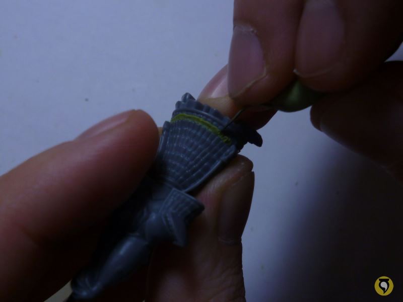
As I said, I hate those nasty reliefs they did on the banner, so I trimmed them off very carefully with the knife. I said very carefully… I can’t stress this strongly enough. The less care you give to this trimming, the more putty you will have to use to correct defects afterwards.

Of course, you can always go for the chaotic approach, destroy all the reliefs with a dremmel or similar and then cover all up with putty. Whatever suits you best. But I prefer to be careful.
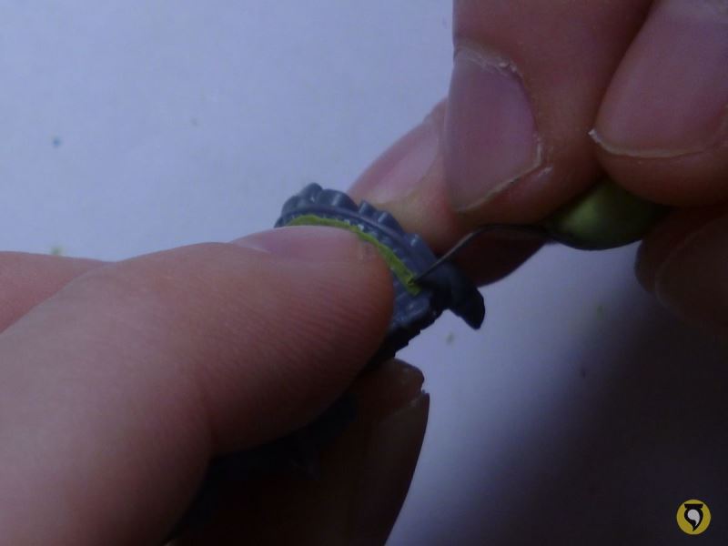
I also passed the knife around the edges of the flag, that way I made them thinner and more like actual cloth, and not thick and unreal.


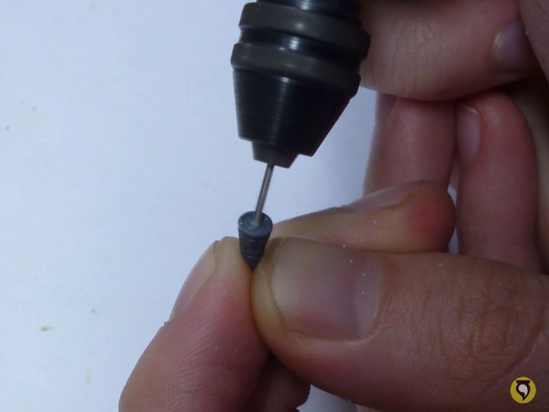
And I also dug a hole on the horn of the musician. There’s nothing worse than a horn or a gun nozzle without a cavity, it’s so unreal!
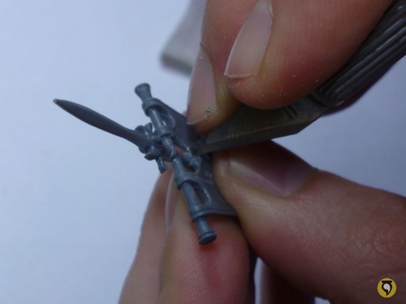
I can’t forget to trim out the reliefs of the hero’s sword. What a bad idea from GW designers to do this stuff. I hate when they do that!

Ok then! Ready to start with the putty! Formation!

Now I did some minor transformations to the Swordmasters. Mainly I added extra rows of scales in between the others which already existed, and then filled any gaps or imperfections with putty. So for the work on the extra amour scales, I first knead a little thread of putty. It’s made from Green Stuff and Milliput mixed on a 50-50 basis, because it provides the flexibility and stickyness of the Green Stuff and the ability to be sanded after cured of Milliput.

Then I posed the thread in between two rows of scales, carefully making sure it adhered properly.

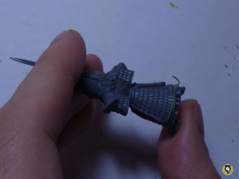

With my “lightsaber” (a custom made tool which resembles a GW sculpting tool, but slimmer) I started giving shape to the scales.
And this was the result.

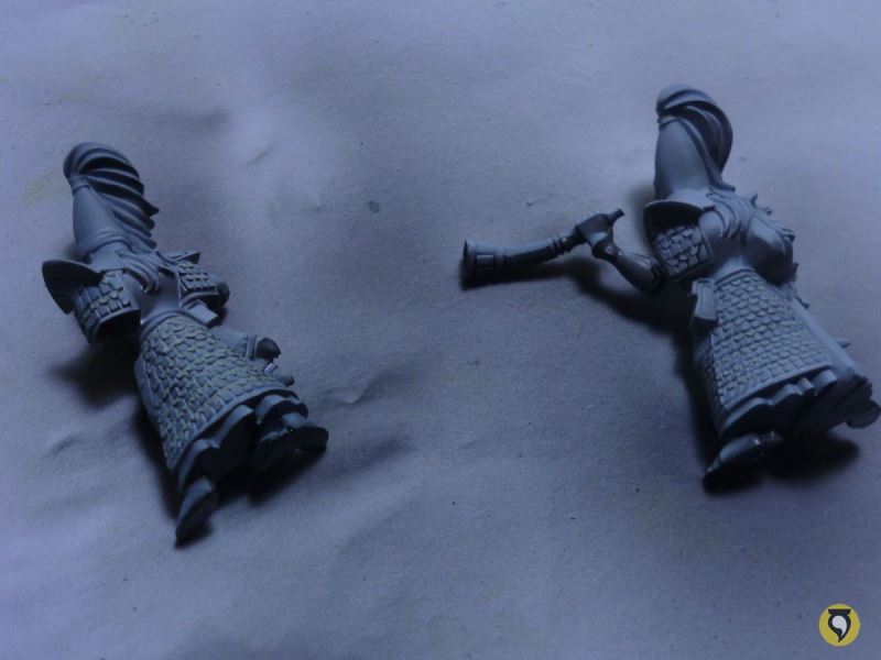
I did this exact process for each and every one of the rows I wanted to add on each Swordmaster and after some hours of hard work (not that hard really, but at least it takes quite some time) I had pimped the whole unit. Notice that I also filled some gaps in the banner and other areas, like some fixing I did on the hero’s face.

Good job, I’m proud of myself. Now let’s give the babies a little bath with soap, scratching gently with a toothbrush to scrape all dirt and grease away.

Watch them dry on my ugly towel! (The towel where the
Sea Guard dried was actually prettier).

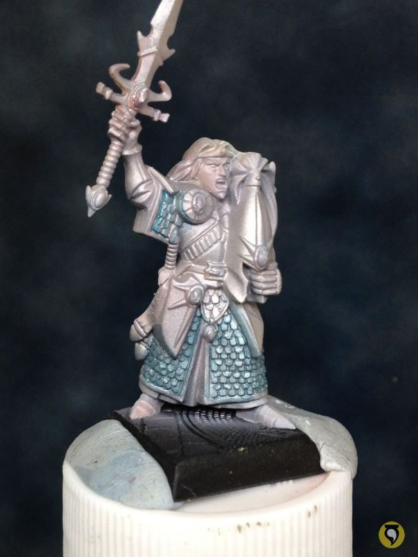
And now time to prime them, with my usual airbrush tecnique, Gunze Sangyo Hobby Color Matt White.

This time I tried something slightly different. To mark crearly where shadows will be, and by the way, edge highlighting and saving some time, I airbrushed all the Swordmasters with black from below, creating a guiding shadow.
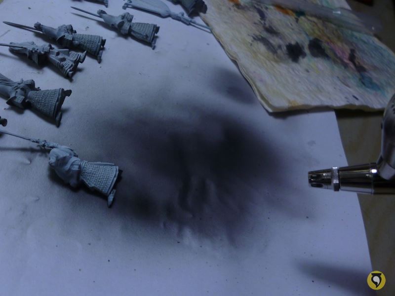
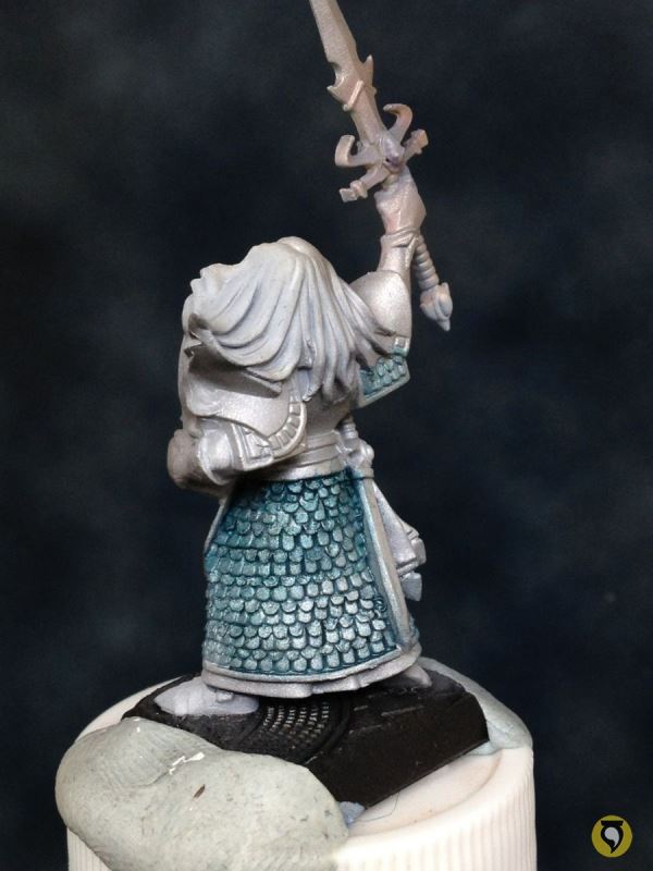
Here they are, after the lower black priming.
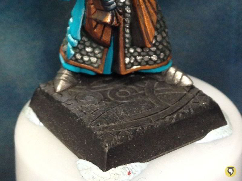
And as I said before, I based them before painting, to save time (proof of why experience is so important). The bases were made with Milliput, pressing the bases to some one-side moulds I have of these temple terrain, I place them over the base before the Milliput is cured so that they fit perfectly.
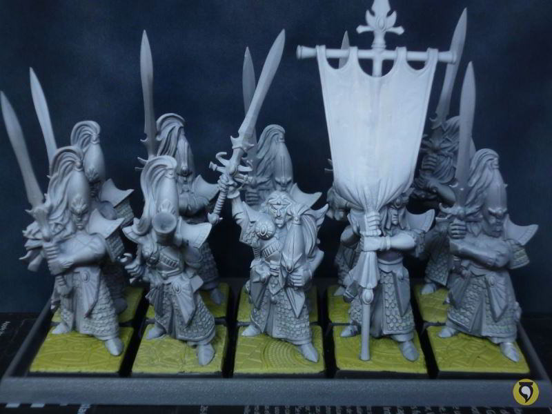
Once the Milliput is hard, I remove the miniatures from the bases, prime the bases with a dark colour (I used black and dark blue) and then glue them to the bases.

The Painting Plan
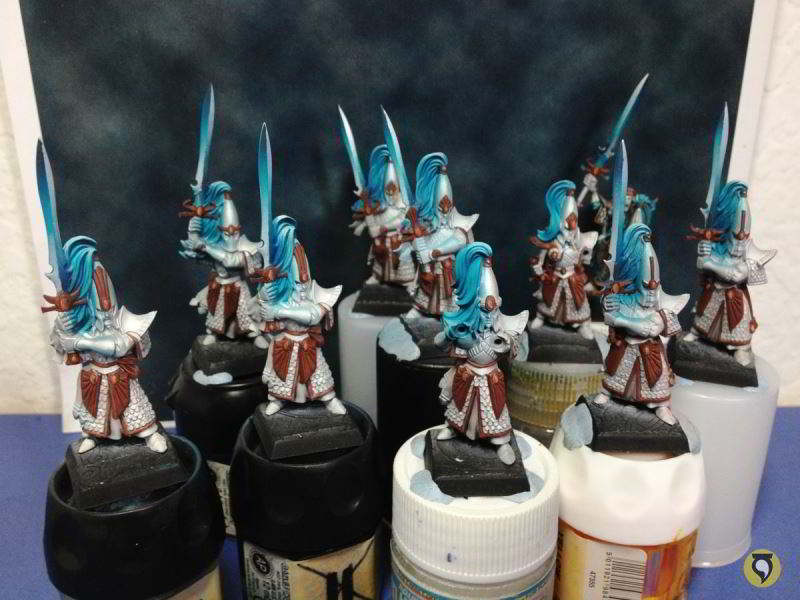
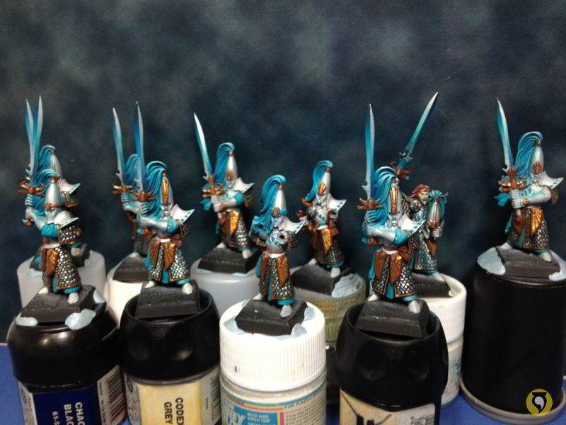
The painting process of the whole unit should start by completely painting one of the Elves. This is to get the general idea of how the colour scheme works before putting effort on painting 10 guys, in case there’s changes that need to be made. This certainly saves us a lot of time! Even so, there was a lot of work already done in the High Elves Sea Guard unit because the colour scheme would be very similar (they would be part of the same army) and there were processes that I would reuse. Therefore, I planned the painting process beforehand. Let’s break down the steps:
- Gems (airbrush)
- Metals (airbrush)
- Hair (airbrush)
- Brushwork
- Edge Highlighting
- Banner
- Bases
Looks good and straightforward! 🙂
Airbrush Work
So first of all, airbrushing gems. I did this before, exactly the same way, in the High Elves Sea Guard unit, but I will explain it once again for those who didn’t follow the other process. Bear in mind that every step I mention is done on every gem, on every elf.
Airbush of a very light yellow over the whole gem.

Airbush of fiery orange over the gem, trying to leave a bit of light yellow on the edge.
Airbush of blood red yellow over the gem, again leaving a bit of the previous steps to be seen.
Final airbush of chaos black over the upper edge of the gem.
As you can see the result isn’t perfect, but it’s more than ok for a first approximation. You have to consider that we will use airbrush later, and the appearance of the gem will change with the rest of the elements in place. But with this serial work we will accelerate a lot the painting of gems. So let’s cover the gems with liquid mask.

Now let’s get back the priming base colour on those areas that were airbrushed with other colours, and then I will airbrush a base metal (Mithril Silver in this case, as the metals in the elves are very bright).
As I said, all this work has been done on all the elves, following a serial process. I’m going to switch back to painting just one elf, to test colour scheme, as I said. Let’s work on the armour scales, washing them with some blue and green inks, very dilluted.
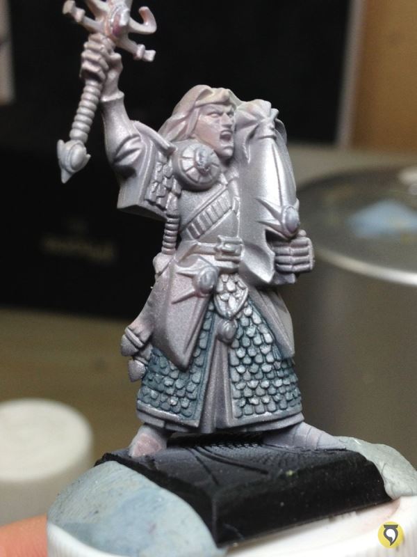
This process has to be done carefully, inks are very strong so they paint a lot. When painting it’s usually better (in terms of time) to be left short than to have to go back!


The scales are now very dark, I got back the metal by carefully painting the scales with Mithril Silver, now respecting the general light and shadow scheme on the tunic.

Let’s leave the scales there and give some colour to the rest to get a general idea. Here’s some basing of gold metallics (matt brown before introducing metallic pigments), turquoises for hair and inner tunics, and red for the elf’s hair.
Continuing on some detail painting, see how the white and blue squares make a big difference.

And now introducing the metallic gold. The scheme looks good so far. The only thing that is not well tuned is the red of the hair. It has to be much darker and colder. Living proof that I did very well experimenting with a single elf before painting all serially!
Even so, I saw that to make progress on the elf I needed to start shading metals of armour and swords, and that is really much better done serially. As it wouldn’t affect my choice of scheme because I already knew it worked, I switched back to serial painting from now on.
As I said, I followed the same tecnique I used to paint the metallic parts in the High Elves Sea Guard. The idea behind the process is exactly the same so I won’t explain the reasons and conclusions of it. If you want more information about it, make sure you check out the Sea Guard process.
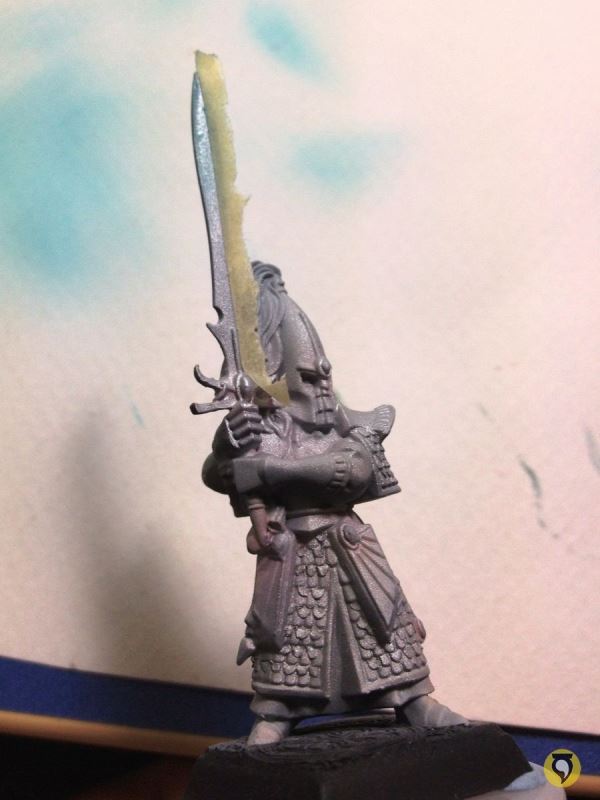
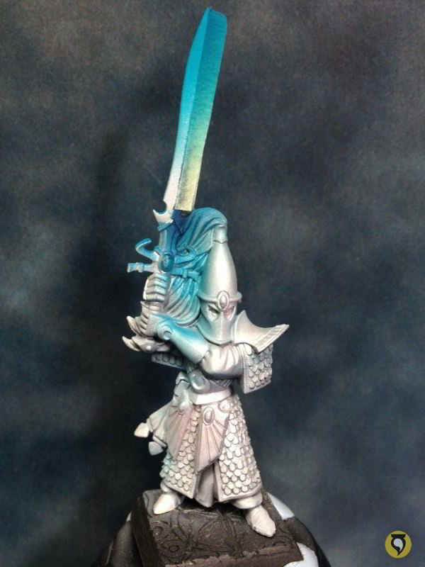
Here are some of the elves ready to be painted. In each of the elves, I have masked one of the blades on both sides of the sword.
Here is how I would apply the paint on the sword, gradually, with airbrush, applying thin layers of semitransparent paint. Remember that the colour in the airbrush is only changed after the whole batch of elves has had that colour applied, on both sides of the sword.
The first colour applied is turquoise blue, right out of the paint pot.
First shading was done with the same turquoise, mixed with some blue ink.

Further shading was done adding more blue ink as well as green ink.
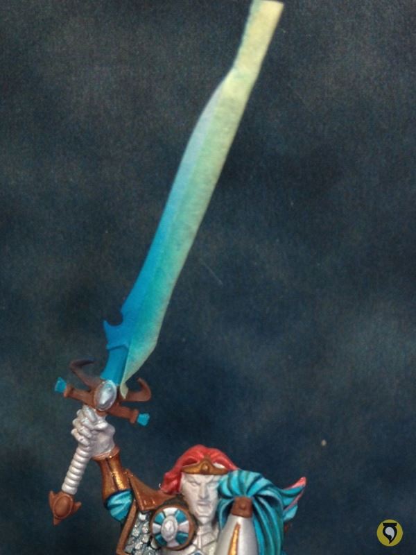
Final shadowing was done with just inks, and adding a little bit of black.

Now it’s time to do the same on the other blade, so I masked the blades I had just painted.
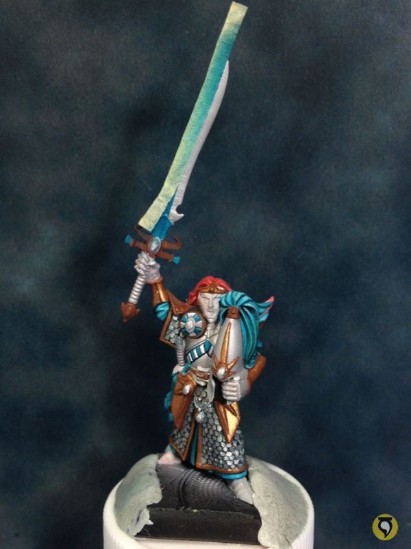
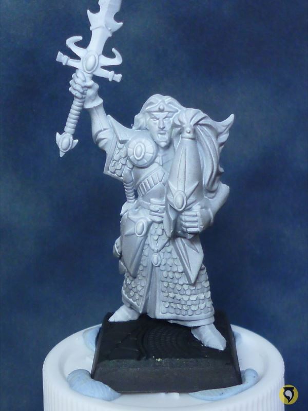
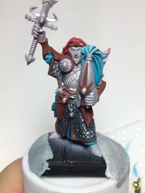
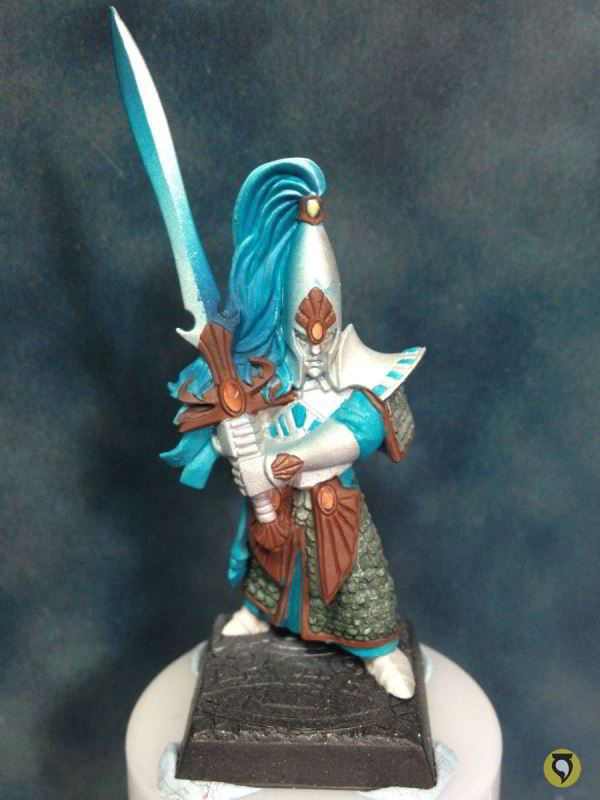
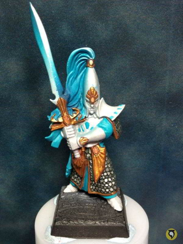
Before I continued with the sword painting, I got a sudden rush of motivation to continue painting the captain, and I needed it completed before I moved on to the rest. Always follow your muse!
So what I did is change the bracelets and the right shoulder pad back to silver. I think it worked much better in greyish metals than in gold. It’s much more coherent with the general scheme, and also with the Sea Guard.

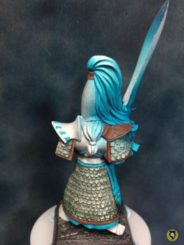
And now I changed the red of the hair, which needed some serious work since long ago. I made the red much colder, adding some blue tones, and made some fine work on the hair to highlight and shadow, especially in the back part of the hair which unfortunately you cannot see in this photo.

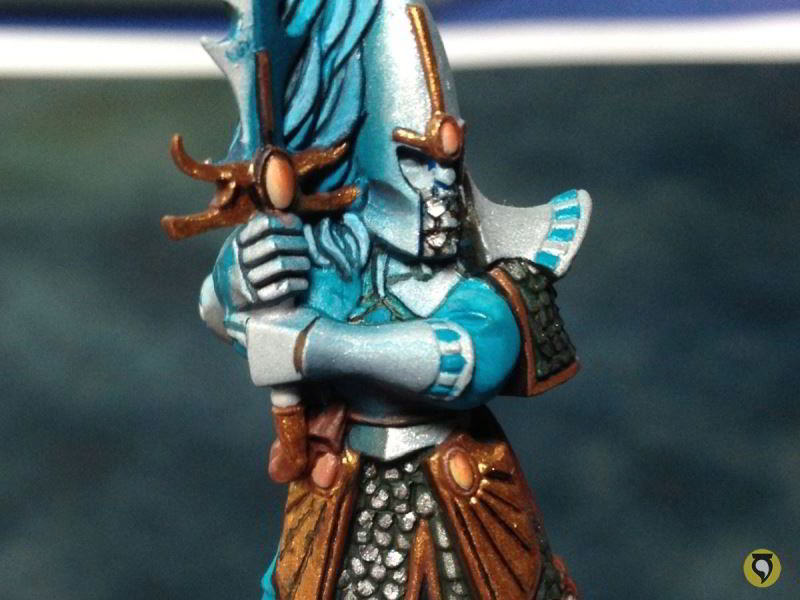
Back to the metallic airbrush work. Same way as before, some turquoise to shade that polished silver.

I wouldn’t be using the airbrush to shade metals after I finished with the sword metals, so I used this last batch of shade colours with airbrush to add some shading on some parts of the armour, and also paint the helmet manes. Regarding the armour, the key was to shadow those metallic elements which are closer to blueish parts of the miniature. In this case, all the miniatures are very similar so I just had to concentrate on the metals that are close to the blue manes of the helmets. You can see in this one how I shaded the side of the helmet and the top part of the bracelet.
The same must be applied to the back part of the helmet. Though I must say, in this case I exceeded myself. I would have to fix that with some airbrushing of silver metal.

Next shadows with blue inks, as well as green inks.
Basic work on helmet manes is easily done with airbrush. I needed to mask the elements that surround them or else I would destroy for sure the work already done in swords and armour. Here’s where all that liquid mask (Maskol) comes in handy. First, the base with turquoise blue.
Then shadows, adding blue and green inks to the mix. Check how I didn’t paint the top part of the mane to leave it white. That’s my maximum light and I want to leave it white for now as it will give me a very nice contrast when the unit is displayed altogether. Also notice how half the helmet has turned blue. No problem, the mask will do its job perfectly.
So once this serial work is finished, I take off all masking. here’s how the whole unit looks like.

I believe serial airbrush work is finished. I will start using brush from now on.
Brushwork
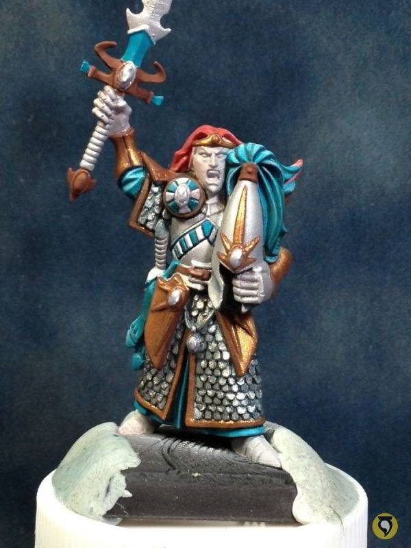
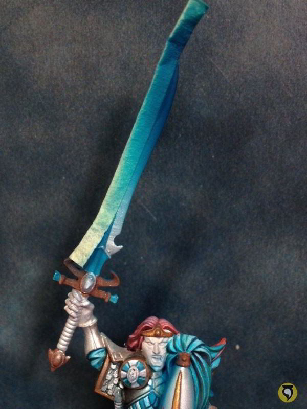
So let’s go back to the Captain since I wanted to start finishing him off. The metallic work on the sword with airbrush is finished, now I would do some edge highlighting to the sword with very light metallics (Mithril Silver and Metal Medium).

Close up.
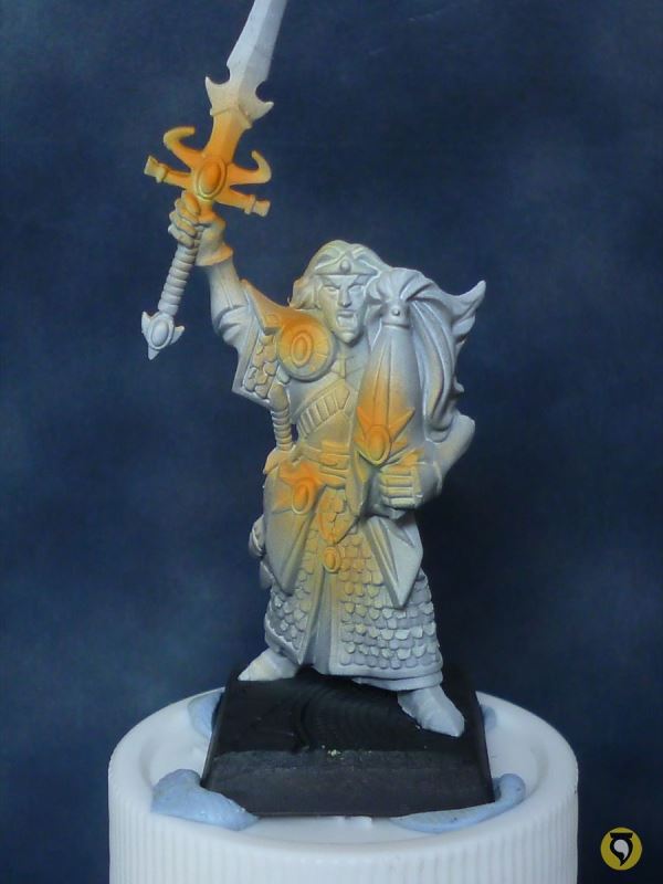
Even though the gems were initially done by airbrush, now that the rest is starting to become finished, they looked dull. They needed some edge hightlighting and deeper colours so they could stand out. Red, black and inks, and then the light spot for the glass shine effect.
Another close up.
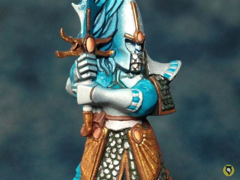
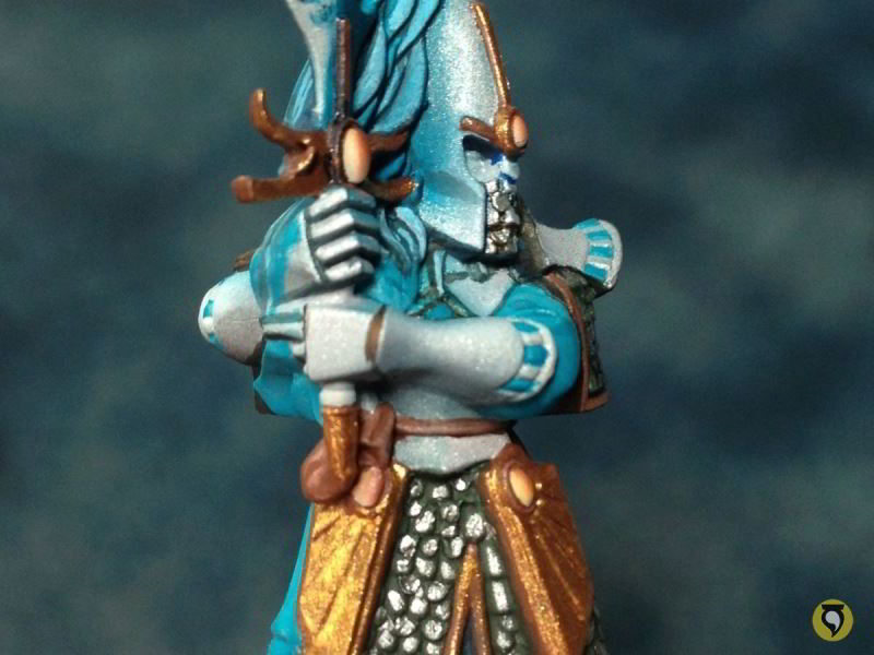
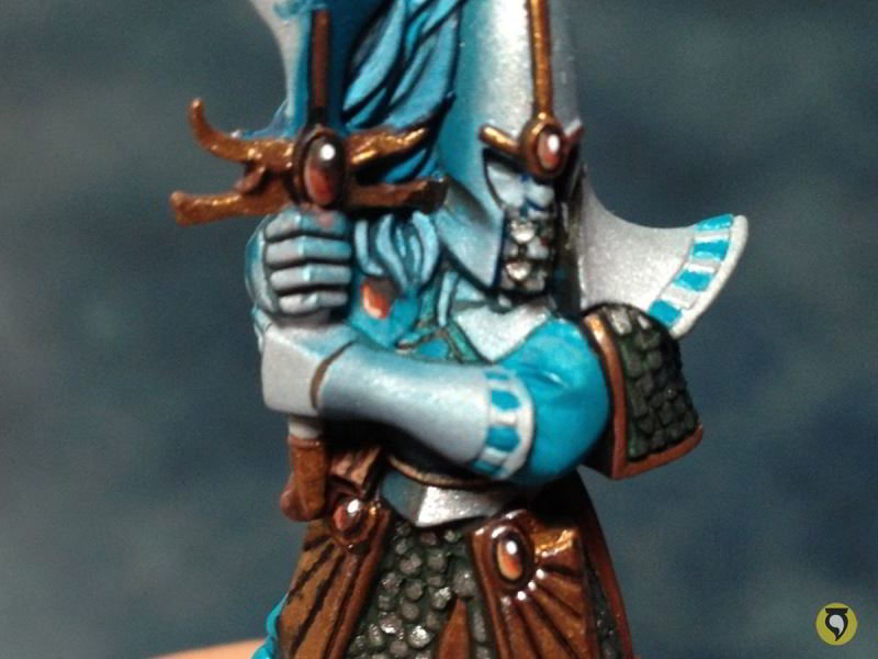
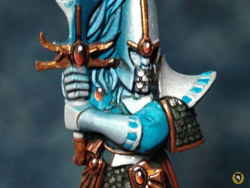
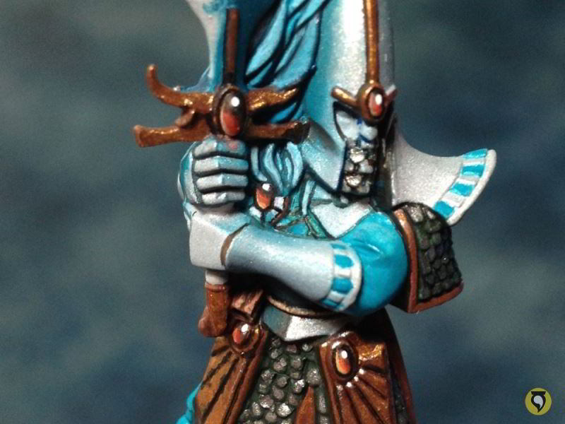
And now the face. I wanted the skin to be fairly elvish so I kept it very light and white. Also I finished up some more gems.
And closer.

Ok, now I went back to serial painting again, but this time by brush. It’s time for gold metals. First, a base surface of reddish brown which would help the gold metal cover better.
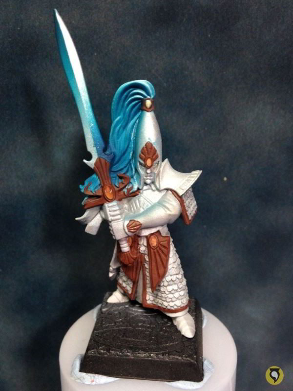
Photo of them all to show that I wasn’t lying on the serial painting fact.
I also needed to complete the blueish parts of the clothing by brush. It’s time to do it now, again, serially.


The metals of the tunics are somehow hard because they require a lot of work on little details. Painting ten of them will be painful but let’s stop complaining and get to it. First, base surface of dark green on all the scales.
This was a first coat that was left to dry while I went on to another elf. It needs another hand of dark green.
Now that I have it covering well, I will paint each metal scale, one by one, carefully and patiently. This is the worst part. Also, the metallic basecoat for the gold.
Ten of them was a big amount of work!
Now it was time to start dedicating my effort to painting details. I started with the hair, which was previously airbrushed for basecoat, lights and shadows. I increased the contrast and edge highlighted a little bit. In the next three photos, the only changes you can see are around the blue hair area.
Here I increased the shadows with navy blue and some blue, green and black inks in different proportions.
The lights were also pushed up, but introducing Space Wolves Grey.
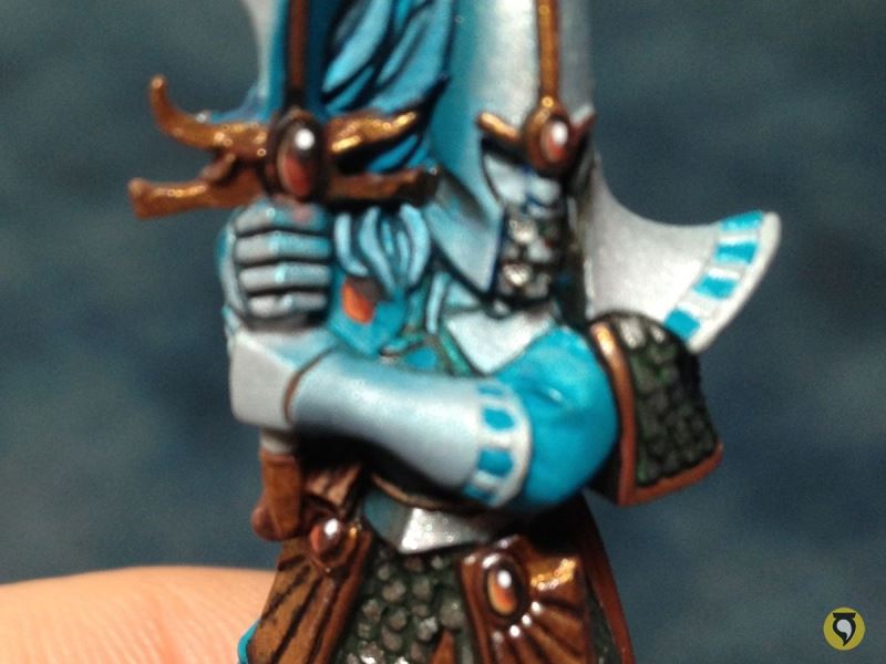
That would be all on the hair. At this point I showed how I work on the metallic parts with brush.
Take a look at the metallic bottom part of the torso, just after that rope that serves as some kind of belt for the elf.
The base was just Mithril metal with airbrush. As you can see, the surface is rather dull, not shiny. That is because the airbrush kills gloss. But no problem, that will be an advantage. I will start shading the metal by adding more matt and dark colours. First glazes of navy blue.

I continued slowly, step by step with no rush. The important part of metals is to ensure that we keep smooth transitions. So the next few photos each contain a single application of paint, so you can get an idea of how many steps I’m doing. (Forgive me for the photos, they are done quickly with a phone camera).
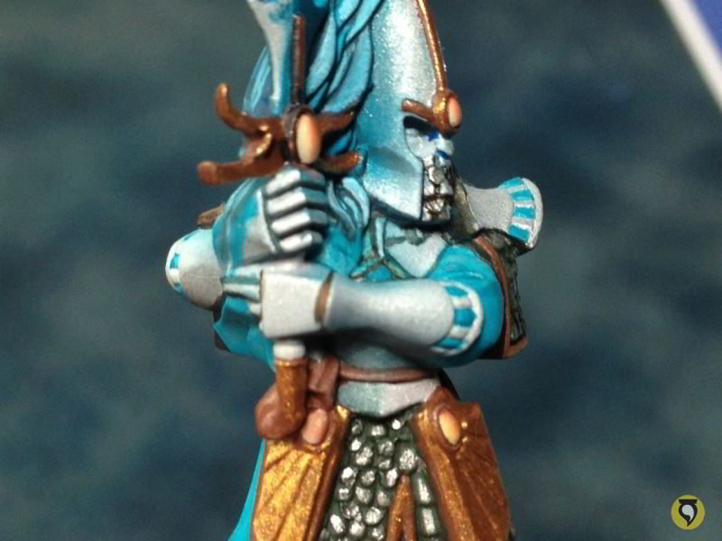
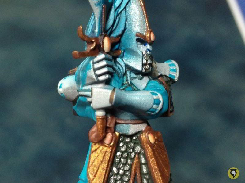
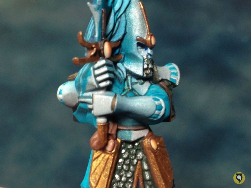
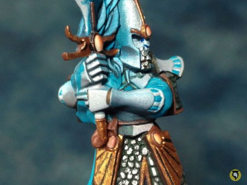
Now that I’m satisfied with the shadows, I can get the gloss back to make the lights shine. Check out the other edge of the metallic armour.

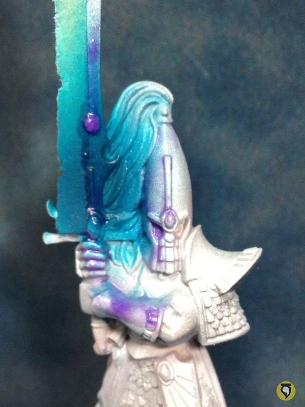
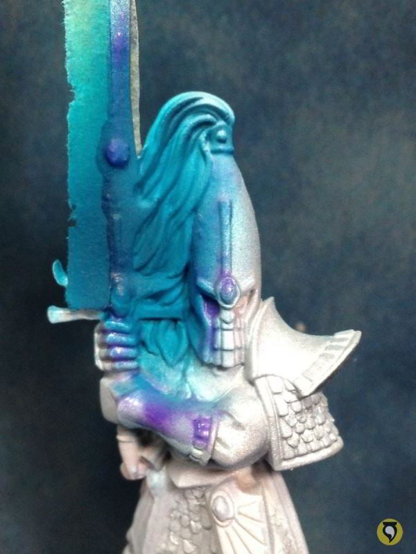
Creating New Volumes With Paint
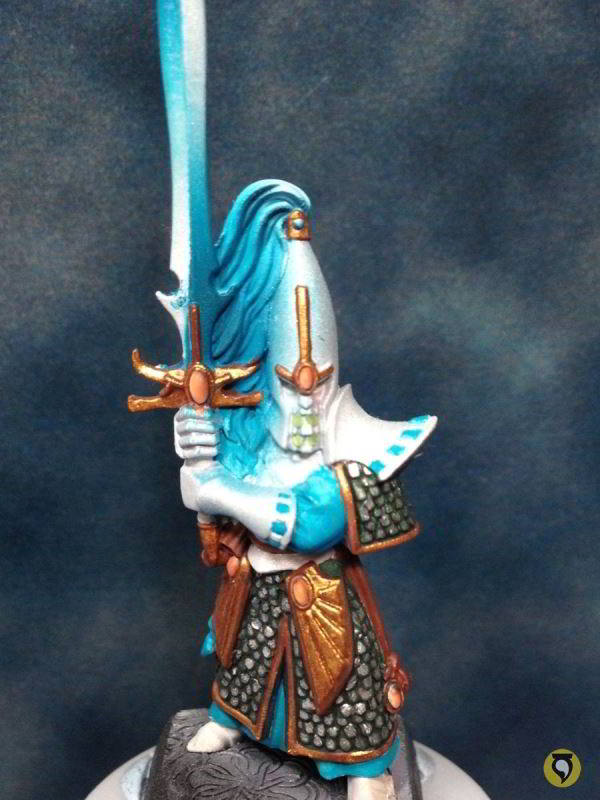
The following photos are very interesting in my opinion. They show how to create volume that does not exist on an otherwise flat area. Check out the circle (at this point blue) surrounded by the hands and hair.
If you take a look at the elf hero of the unit, you’ll see that the circle is actually a very nice signet with a gem surrounded by blue and white squares. Well, unfortunately for me, designers of this miniature decided to skip that detail, I guess for production saving purposes, and left it boring plain. Unfortunate, yes, but a very interesting opportunity to show off and have fun. Let’s create the feeling that there is indeed a gem and the blue and white squares with just paint.
I started by placing a red gem ellipse in the middle, to have an idea of where the elements will be situated.

I put some black on the top part of the ellipse.
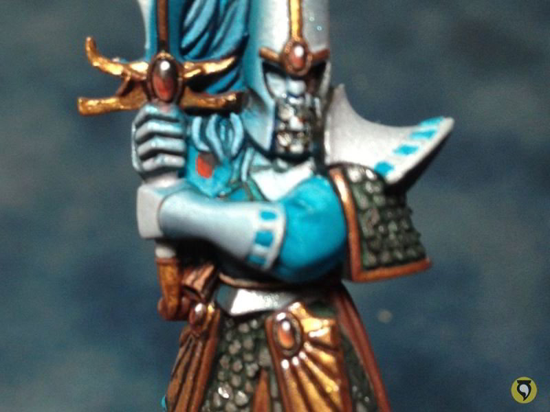
A bit of orange on the bottom.
Bottom outline of ice yellow on the ellipse.
The shiny white spot to represent the natural shine of glass.
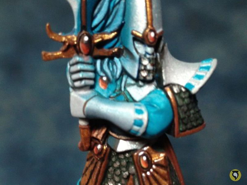
With navy blue, I marked very lightly the squares that surround the gem.
With the same navy blue and a little bit of inks to get intensity, I outlined the squares.

White to the squares, and final edge hightlighting in general, as well as the tiny metallic rivet that frames the gem and the signet. Voilà!
Isn’t it great? I love to do that. Come on sculptors! Take more details out of me! I dare you! Bring it on!!!
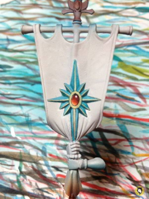
And now that I’m so motivated with freehands, let’s work on the banner. But before that, let’s paint some metallic boots.
They were supposed to be the same material as the shiny elvish armour, so we can use the same process. First, basecoat of Boltgun Metal.
First highlights with Mithiril silver, respecting the basecoat middle tone of Boltgun Metal.

Final highlights on the edges and shines of Metallic Medium. It’s very difficult to see it in the photo, but trust me: it’s there.
Some shadows are also necessary, so a little bit of glazing with blue and green ink tones to get that reflection effect working.
And that’s it with the boots! Let’s go with the banner then.
Standard Bearer Freehands
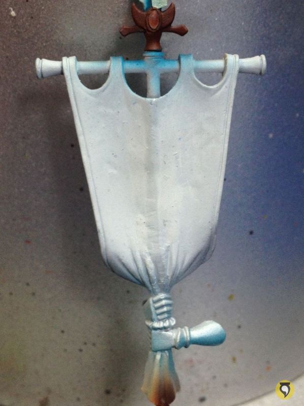
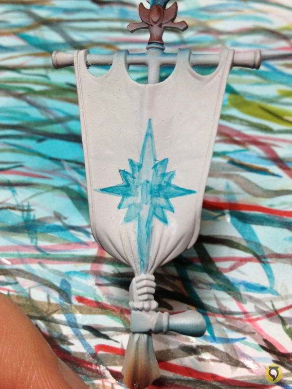
First, primed white, as usual.
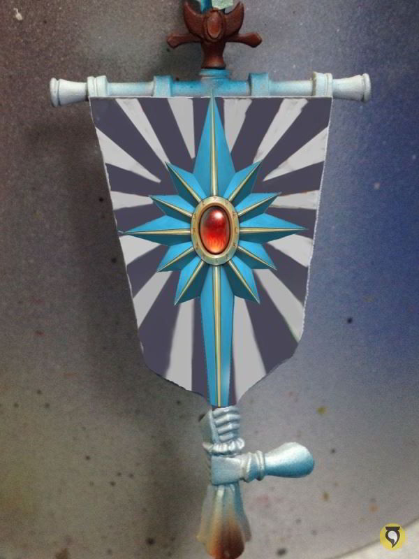
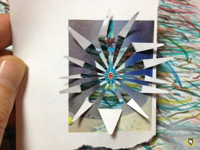
From that “white canvas” kind of photograph, I made a design in my computer (don’t forget
my article on the subject) and then I printed it to actual size so I had an idea of what I was doing.
And then I started painting. I felt kind of lazy about doing the airbrush template process, so I drew directly lines from scratch. I began by shaping the turquoise star roughly.
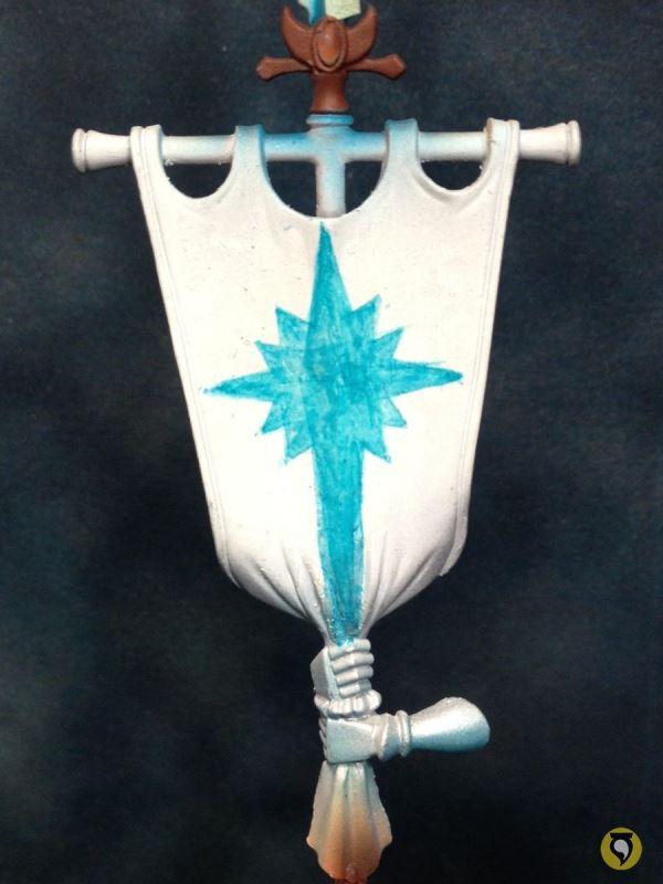
I painted the shadow on the star arms once I was happy with the overall shape and proportions.
Then I highlighted the arms with Space Wolves Grey.
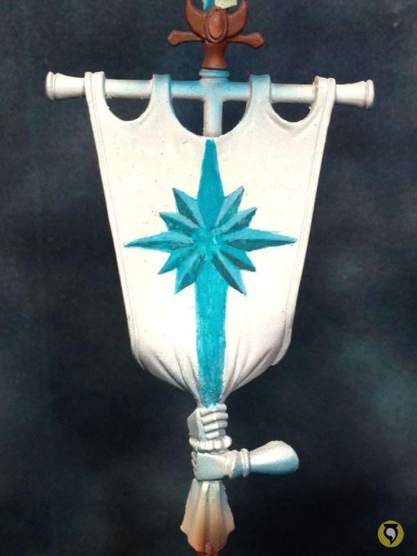
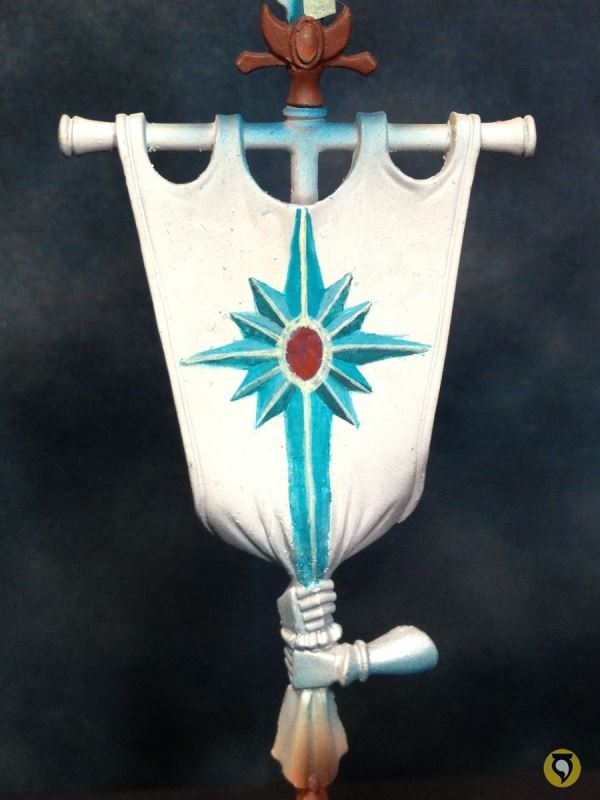
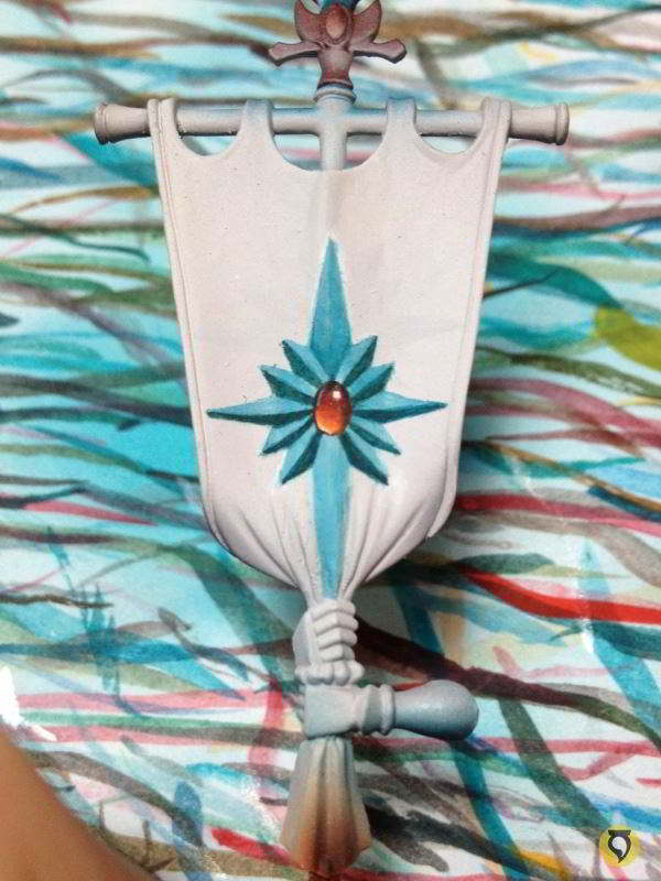
I placed the red ellipse which would be the gem in the centre.

And then edge highlighted the metallic frame in the star with Ice Yellow. It’s a little rough but no worries because I would fix it all as I painted. It’s important to have it all properly outlined first and then clean it up.
So this is how the star looked after some more edge highlighting, cleaning here and there, and edge highlighting some more.

Sadly, I wasn’t happy with the star. So I wiped it out of existence.

Before you start shrieking in confusion, let me explain. Some of you might have guessed what was wrong. If you go back to our previous computer design you’ll see I didn’t take into consideration the top shape of the banner. So without considering that part of the banner, the star is placed high in the standard, but when the gaps come in, the star is placed way too high and the composition is not balanced. So back to our white canvas!

And back to our computer to re-position the computer design.

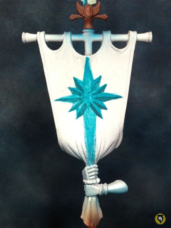
Now the star rough drawing is situated much lower.
The goal now is exactly the same as before, but the process in freehands is not a strict guide to follow, so I finished up the gem first, just because I felt like it.

Now I coloured the whole star.

Then shadow edthe lower part of the arms.
Ice Yellow again for the metallic frame.
And now that the star was starting to look good, I focused on the background. I used airbrush to shadow the outer parts of the design to concentrate the light on the star, which is what I was interested in.

I realized now that maybe shifting out of my normal airbrush template process wasn’t such a good idea. But no worries, I could improvise some template for the star rays with the actual printout of the design.
Carefully, and masking other parts of the banner to avoid troubles, I used it as template for the airbrush. This is the result. I cleaned it up with some brushwork.
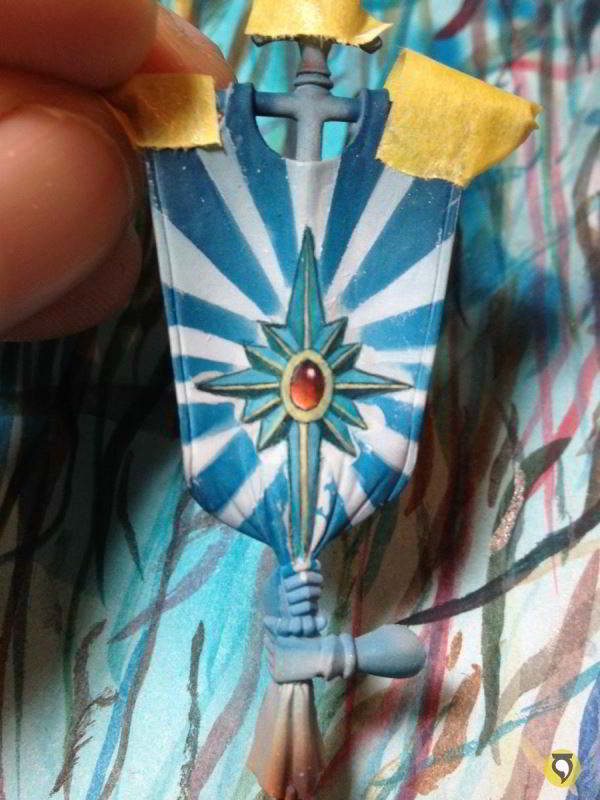
The upper part of the design is a little empty, so I introduced a couple of elven runes to fill it. This is after I cleaned the airbrush work, of course.
But as much as you clean, there is always more cleaning to do.

Now it looked nearly finished, so it was time to integrate it all together with some glazes with the airbrush, again shadowing the outer parts of the flag to make the star pop out.

And a bit more to make the contrast stronger.

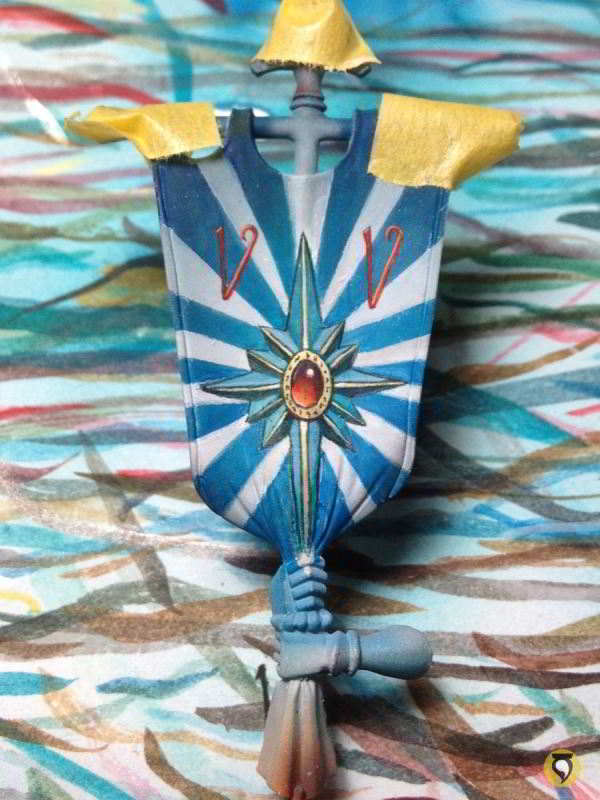
And finally, back to the brush to bring back the pure white on the areas closer to the star.

That is more like it. Now I was happy!
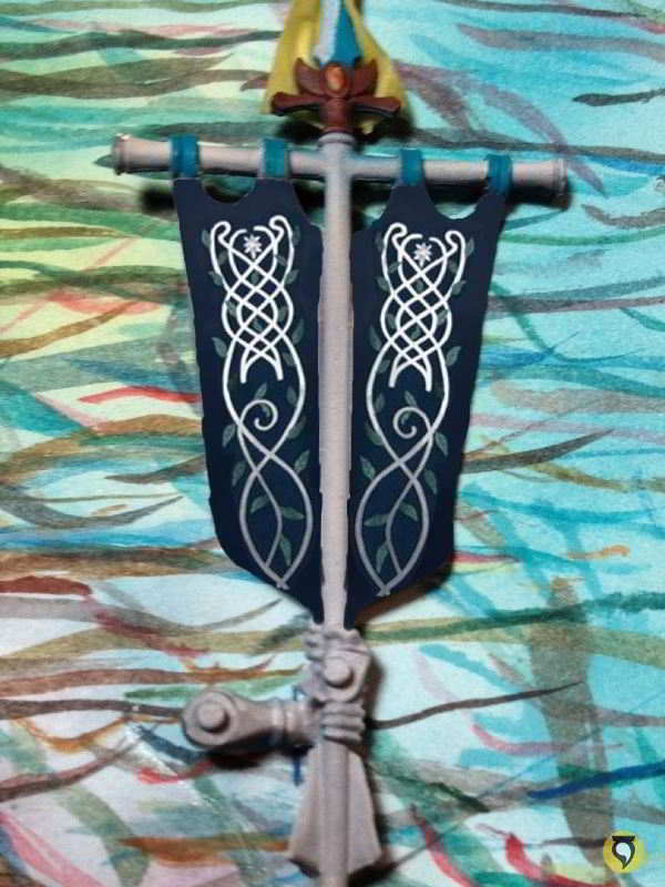
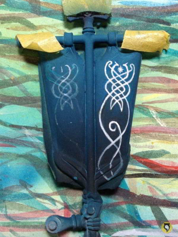
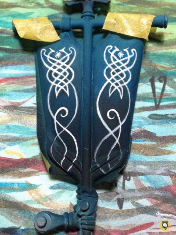
I decided that for the back part of the banner I would be using a simple yet effective elvish filigree design.
I just searched the web for cool elvish designs and then edited the motif to my intentions in the computer.
So this is what I wanted to achieve. But first, I should secure the other side of the banner. We don’t want to compromise the work already finished!

Basecoating the banner with Dark Sea Blue, airbrushed.

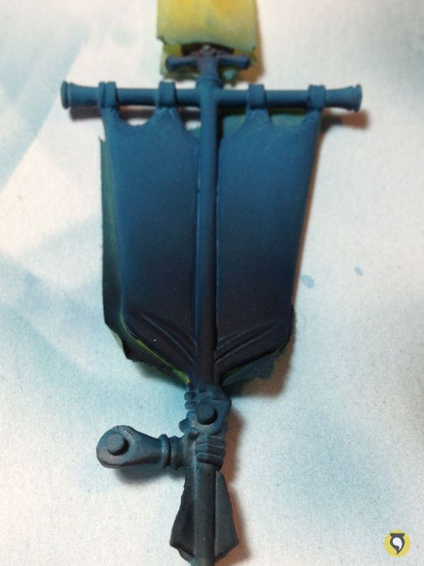
The colour is very light because the priming of the banner was white. So I worked to shadows. Dark Sea Blue adding black, airbrushed.
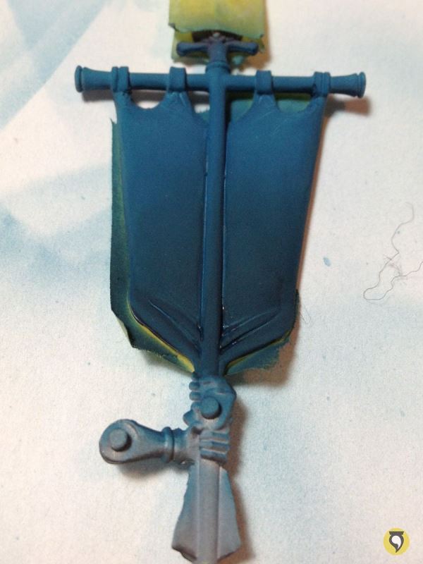
For the final gradient I added some blue and green inks to the mix.
With the blue background I could start painting the filigrees. Very lightly at first; I had a soft guide, something to let me get the proportions and be erased easily if necessary.

From that guide I started drawing more definite shapes. Notice how some of the lines do not correspond to the first guides. I corrected the proportions as I advanced.
As I progressed with the new lines, I erased the underneath guides that were incorrect, just by using glazes of the background colour on top.

The lines become more definite as the whole design becomes clearer.
So when I was happy with the line, I insisted and insisted over it untile the line became strong enough. It is always better to do it in one quick and clean stroke, but that is only for the most skilled painters.
Finally, I corrected all the blurryness by cleaning the lines using the background colour. It could have been a tricky task because of the gradient in the background.
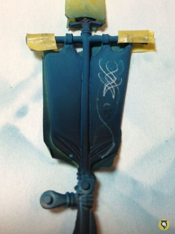
Painting the other filigree was easier, as I had the experience of the previous one and the proportions were clearer.

The process was exactly the same.
The trick was to user lighter lines as guides which would turn into thicker lines as the whole design progressed.
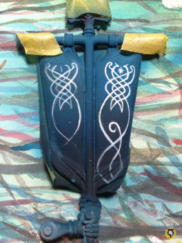
And when I was happy with the proportions, I made them thick and final.
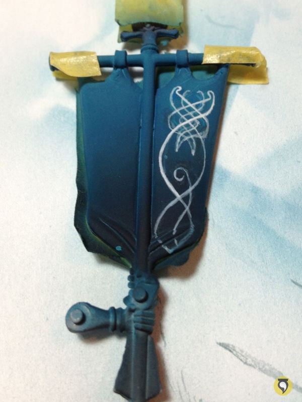
Cleaned the lines by using background colours.
And cleaned some more.
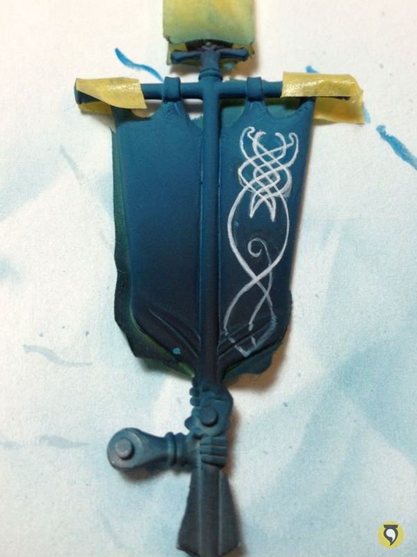
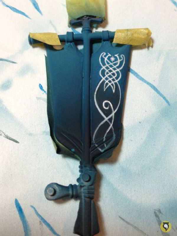
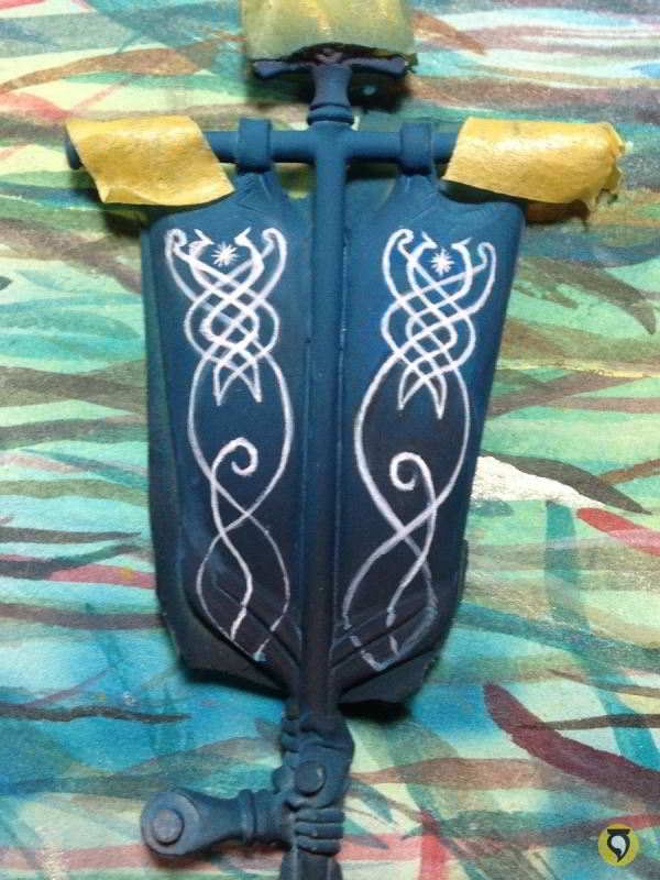
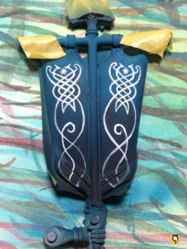
After this I only needed to finish the last details and the bases.
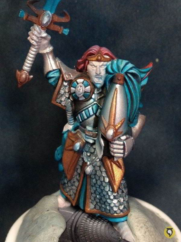
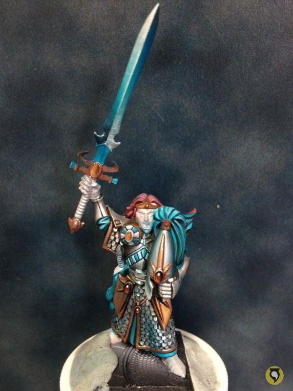
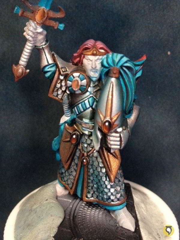
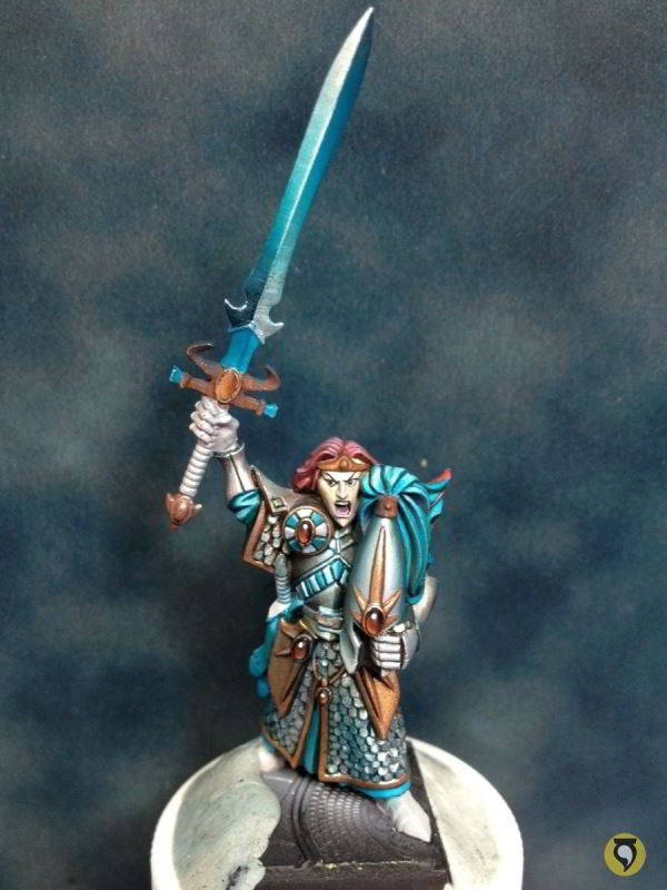
Conclusion
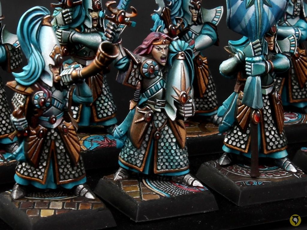
And so thats it! Check out the final results here.


 unveiled in Taiwan")
It seems so easy explained and painted by you.
Thanks a lot for sharing your method. Very instructive.
Hi Carkel,
It’s easier than you think, just try it and let us know 🙂
Thanks for commenting!
It looks not good during the process before to look, at the end, absolutely magnificent. Certainly one of the most beautiful paint work on the Elves of Ulthuan.
That is what I call “the WIP effect”! 😊
I remember showing these to a good friend of mine while they were in progress, very happy because I knew they were going to end up looking just like I intended them to, and the lad would tell me: “well they don’t look so good to me, but if you think so…” 😂